Introduction
If you find yourself unemployed in Austria, you will likely interact with the AMS. It's the primary point of contact for all public employment services, including income support and job-seeking assistance. In everyday language, if you’re unemployed in Austria, you are “on the AMS.”
The AMS's aim is to match labor supply and demand as fully, sustainably, and economically as possible—within the framework of the Austrian Government’s full employment policy. It seeks to prevent and eliminate unemployment while upholding social and economic principles. (Paraphrased from the Employment Service Act – AMSG.)
In 2024, I was among the many UX professionals affected by industry-wide layoffs. Becoming an eAMS user myself, I saw opportunities for substantial improvement and decided to redesign the experience as a personal side project.
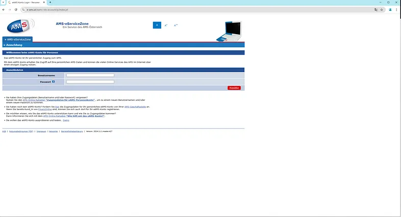 A screenshot of the eAMS login page, viewed on a 1440p 16:9 monitor in Google Chrome.
I began with desk research, comparing Austria’s government digital services with those of other EU countries, and globally (USA, UK, Canada, NZ, and Australia). I then designed a small research program: a SUS survey, one-on-one interviews, and a co-design workshop to explore pain points and ideate potential solutions.
Research
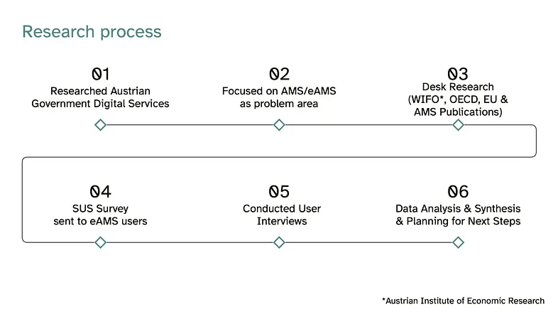 An extract from a Miro presentation on this same topic showing my process.
SUS Survey
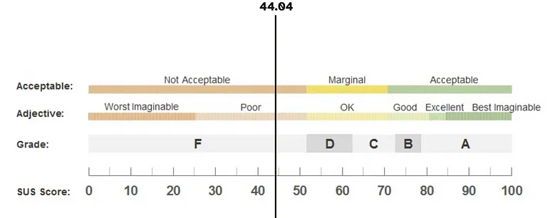
I recruited 27 eAMS users who had used the service in the past six months to complete a System Usability Scale (SUS) survey. This standard industry questionnaire uses a 5-point Likert scale. The result was a disappointing average score of ~44.
User Interviews
Five survey participants agreed to participate in semi-structured interviews to explore deeper usability concerns.
Participants:
- 3 female, 2 male
- Aged 28–34
- A mix of Austrian and non-Austrian citizens
With informed consent, interviews were recorded and analyzed using open coding for themes and sentiment.
Key Findings
-
Poor layout and confusing navigation
“The eAMS is clumsy to use. The design and user interface seems very old-fashioned and inefficient. The functions are sufficient, but even navigating the menu feels bad.” — P1
-
Lack of personalized support for professional training
“A system that needs printed instructions to tell the users where to click is bad. And yes, the AMS gave me printed instructions at my first appointment.” — P2
-
Redundant processes
“Filling out two forms with the exact same questions, digitally, is so unnecessary. You already have the information.” — P3
-
Difficulties for non-German speakers
“When I use Google Translate, the site just crashes and sends me back to the homepage.” — P4
-
Confusing registration process
All participants found registering as unemployed confusing and unintuitive. -
Not mobile-friendly
“I had to borrow a laptop just to use the eAMS.” — P3
-
Poor communication with AMS staff
“Why can’t I just email or use live chat instead of waiting in person for a 10-minute meeting?” — P5
-
Subpar job search functionality
“Other job sites have better design and more relevant listings.” — P1
Not Mobile Friendly
When testing the eAMS system myself, I confirmed that it is not mobile responsive. Considering that mobile devices dominate internet usage, this is a major usability flaw. As of now, 93% of European government websites are mobile-friendly—it's surprising that such a critical service in Austria is not.
Co-Design Workshop
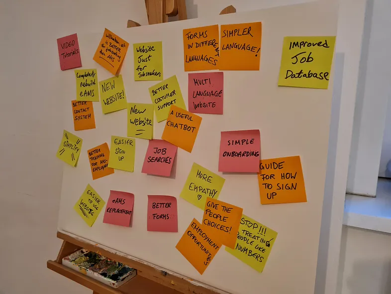 My ‘Whiteboard’ was a canvas & easel. When you’re using your living room for UX workshops you work with what you have :)
Interview participants joined a co-design session to ideate solutions based on earlier findings. We used this guiding question:
How might we help jobseekers find relevant jobs and training to support them in securing employment in the Austrian labor market?
Each idea was written on a sticky note and added to a shared board (a canvas & easel—my living room UX lab). We discussed the potential impact of each idea, grouped similar ones, and used dot voting to prioritize them.
We then mapped ideas on a prioritization matrix to assess impact versus effort.
Recommendations
Low Effort / High Impact
- Clear call-to-action on the AMS homepage for registration
- Multilingual guides for registration and service overview
- Simplified forms and reduced redundancy
- Enable direct email contact with AMS supervisors
- Audit and improve web content strategy
High Effort / High Impact
- Full redesign and rebuild of the AMS/eAMS platform
- Improved QA to catch bugs early
- Simplified onboarding and registration workflows
- Add chatbot or live chat functionality
- Better job categorization and modern search UX (potentially partner with karriere.at)
- Fully multilingual interface
Conclusion
The research strongly validated my hypothesis: improving the outdated eAMS website will increase user satisfaction and help jobseekers better engage with AMS services. This includes discovering training programs, finding jobs, and ultimately securing employment.
Given that Austria's Ministry for Labour plans to move most AMS interactions online, there is an urgent need to update and improve the eAMS digital service.
Stay tuned for Part 2!
Appendix
Screenshots from the AMS and eAMS services (captured in November 2024):
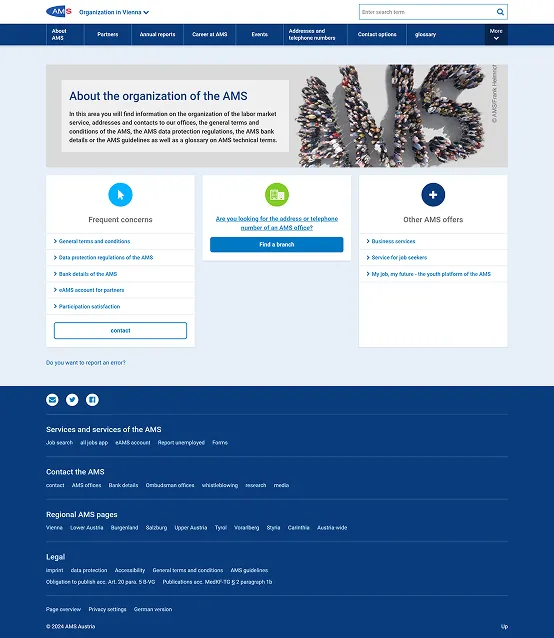 Screenshot of AMS.at
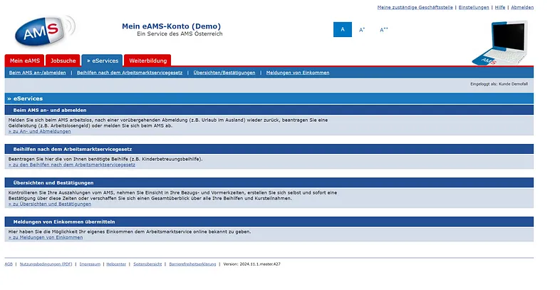 Screenshot of eAMS system
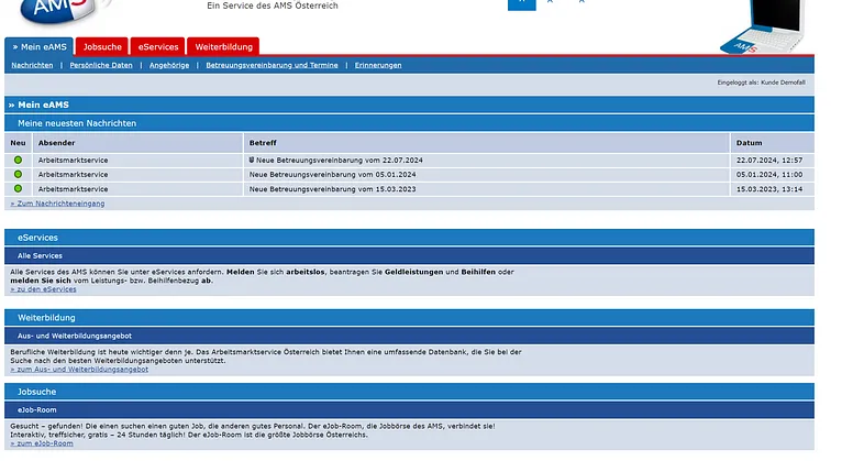 Screenshot of eAMS system
Sources & Further Reading
- Integration Statistics – Austria
- About AMS
- Austrian Census 2021
- 2023 OECD Digital Government Index
- EGovernment Benchmark 2023
- Public Employment Service Austria Annual Report 2023
- "A quarter of migrants with difficulties in finding a job" – Statistik Austria
- Global Platform Market Share – StatCounter
Supporting documentation for internal reference:
- Gudrun Biffl, Satisfying Labour Demand Through Migration in Austria, 2011
- Austria-wide shortage occupations